
BENEFIT is a fitness app design project for college students wanting to get in shape.

process
This was a partner project. Both my partner and myself were equally involved in the research and the design aspects of the project.

Journey map
We created a journey map to understand the emotions of our future users. We chose three main points to focus our app on.

Persona
We created personas to understand the needs of our users. This also helped us narrow our scope to just female Ohio State students.

Wireframes
These wireframes helped us map out exactly what we needed for the high fidelity prototype. We also created these wireframes on paper and did paper testing.

Mood Board
This mood board gives an overview of our design concept. Colors, icons, type and images are all represented here.

Color Palette
We chose a bright and active color palette. This corelated to the mood we wanted our app to give off.

Typography and Iconography
We wanted a san serif typeface that was geometrical. We landed on Roboto. Icons were also geometric as well as linear. This added to the white space design we had.
final

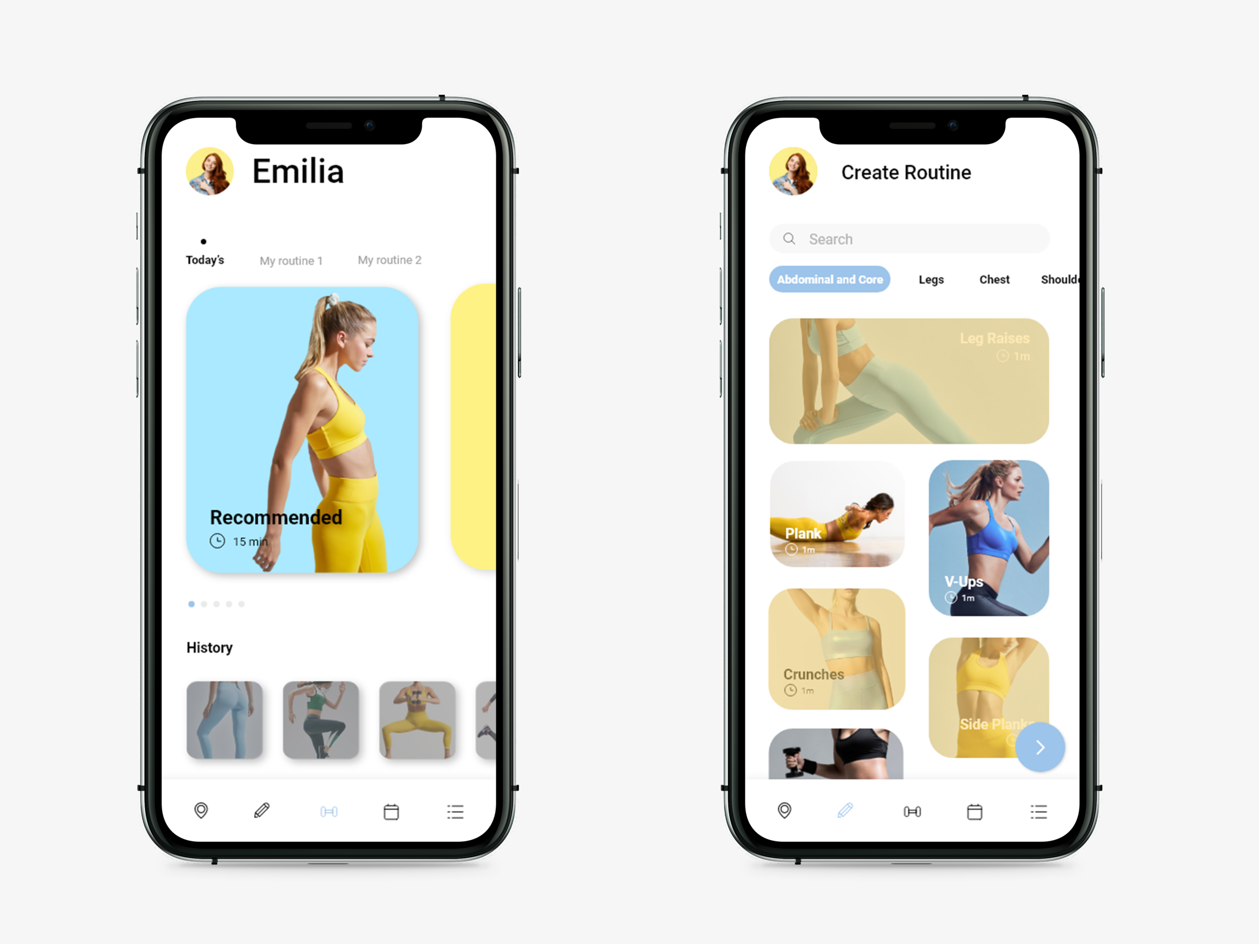
Landing page and Create page

Calendar pages

Program pages